This is Jeopardy!
CONCEPT
CONCEPT
This project describes a new, emerging way to shed light on a complex dataset and to communicate the findings with a broad audience. We begin this process with some exploratory data analysis, then create interactive visualizations and embed them within a narrative using infographics. We illustrate the concepts using data from 30 seasons of the TV game show Jeopardy!. Our findings uncover interesting patterns, both qualitative and quantitative, and explain our use of popular technologies during each phase of the process [1]. In this paper, we describe in detail the process by which we explored the data and built the visualizations that underlie that work.
DATA
The initial dataset, found on Reddit, included qualitative data on over 200,000 Jeopardy! questions. It had data on the round that the question corresponded to, the questions and answers themselves, the dollar value of the question, and the show number and air date.
In our exploratory data analysis phase, we found several interesting results. For example, we found that the most frequent type of answers were related to geography. We also noticed, while looking at the average question value across years, that there was a large increase between 2001 and 2002. In 2001, the average question value was $496. It increased to $940 in 2002. With additional research, we found that the values doubled on November 26, 2001. This finding informed some of the subsequent decisions we made with respect to comparing episodes across time.
PROCESS
In order to analyze the Jeopardy data and generate insights out of it, we followed the a process that looked at the data using the following visualizations:
- Contestant and Gender Infographics and Line Chart
- Exploratory Data Analysis using Tableau
- Exploring the wagers data
- Parallel Coordinate Visualization
- Linking Line Chart
- Scatter Plot
- Bipartite Graph
- Jeopardy! Game Board
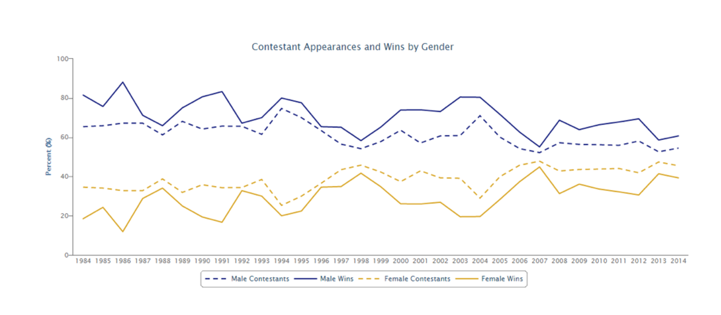
Line chart showing the gender divide
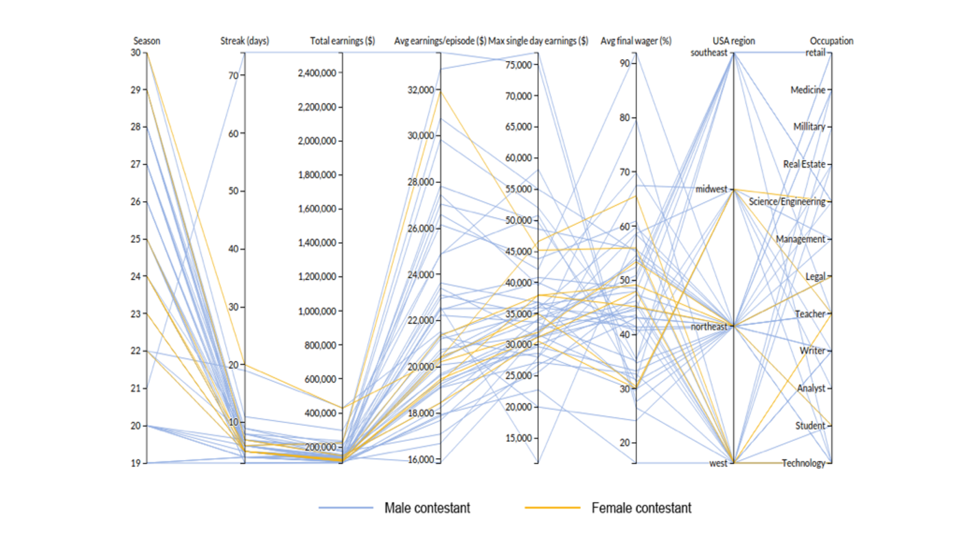
Parallel Coordinate Visualization
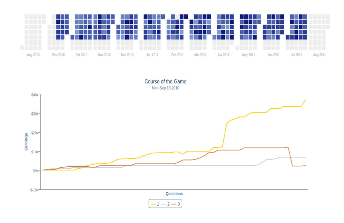
Heatmap and Linking Line Chart